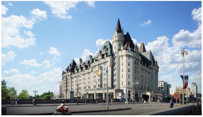
Viewpoint: Château Laurier addition must complement original design
By Emma Jiayue Liu 
Early this month, the developers behind the proposed Château Laurier expansion revealed a revised — but still controversial — new look for this downtown Ottawa architectural icon.
Will the design eventually win over critics? It seems unlikely.
The latest proposal offers a modified version of an original expansion plan that drew much criticism in 2016. The updated idea consists of an eight-storey pavilion with 171 new guest suites, and uses materials such as white steel and glass, according to a Château Laurier press release announcing the changes.
The new design also lowers the height to protect the original building’s sight lines. A courtyard would be created between the existing hotel and the addition as a kind of transition zone distinguishing history from modernity.
As Dennis Jacobs, the principal planner at Momentum Planning and Communications, recently told the CBC, designers wanted the addition to be “visually separated” from the original building.
“The intent was to create a building that was a building unto itself, even though it’s an addition and complementary to the hotel,” Jacobs said.
This is a contradictory attempt at explaining the vision. If the addition is intentionally separated from the main building, how can conceptual unity be attained?
Despite switching the exterior from a “barcode” design to a greenhouse, it’s hard to discern any substantial improvements in the expansion plan. Both the original and revised designs have ignored a key premise for a historical architectural addition: the understanding of the original building’s value to the community and the reflection of that value in the expansion plan.
Looking back to the history, we can see some successful examples. Filippo Brunelleschi’s attempt to add a Renaissance dome to the Gothic-style Florence Cathedral made him one of the most influential architects in the 15th century. The cathedral is now a significant site for learning classical architectural techniques and contextual knowledge of European history.
Contemporary Canada also has a good example of melding old and new. Architect Arthur Erickson’s renovation project for the Bank of Canada respected the original atrium’s classic style and created a large, modern, transparent addition that emphasized symmetry and balance in a way that complemented the original design.
It is possible to expand the Château Laurier in a favourable way, but only by embracing the original building’s aesthetics and styles.
The Château Laurier stands as a fine example of Gothic revival architecture, communicating certain design ideas and aesthetic tastes. Therefore, the planned addition should reflect an approach that connects the hotel to its Neo-Gothic past.
Opened in 1912, the French château-style hotel complemented the adjacent Parliament Hill. And it became a national historical site in 1981. As a building with more than 100 years of history — a place that reshaped the city’s skyline and where many momentous events occurred — it represents something far beyond a hotel; it embodies more than a century of cultural and architectural heritage for the community to remember and celebrate.
Council has approved the application to demolish the hotel’s crumbling eyesore of a parking garage. That makes sense.
But moving ahead with the demolition means the construction of the hotel’s controversial addition could begin in early 2019. On Feb. 28, a public open house will be held at City Hall to gather feedback on the amended design of the proposed expansion.
What’s crucial is that the designers eventually come up with a plan that embraces the historical spirit of this landmark building.
If we aren’t ready for the latest, revamped vision, it’s better to wait a while longer.

